Established confident brand without DIY clichés
ve vatičce is a creative brand built around crocheting as a form of mindfulness, calm, and gentle self-expression. The goal was to create a visual identity that feels warm, approachable, and emotionally grounding while remaining clear, structured, and scalable across digital and physical touchpoints.
Services
Outside links

Translating softness, craft, and calm into a contemporary identity
ve vatičce started as a heartfelt idea rooted in handmade craft, slow living, and emotional well-being. The challenge was to translate this intimate, tactile world into a clear and contemporary brand identity without drifting into cliché handmade DIY aesthetics or visual chaos.
The brand needed:
- full brand identity package including logo, colors, typography
- a distinctive yet gentle visual language
- an identity that feels human, calm, and reassuring
- a system flexible enough for education, products, social content, and print
- visual tools that support storytelling, emotion, and everyday communication
- a balance between playfulness and clarity, softness and structure

A layered identity system inspired by yarn, rhythm, and repetition
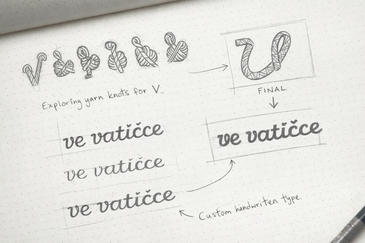
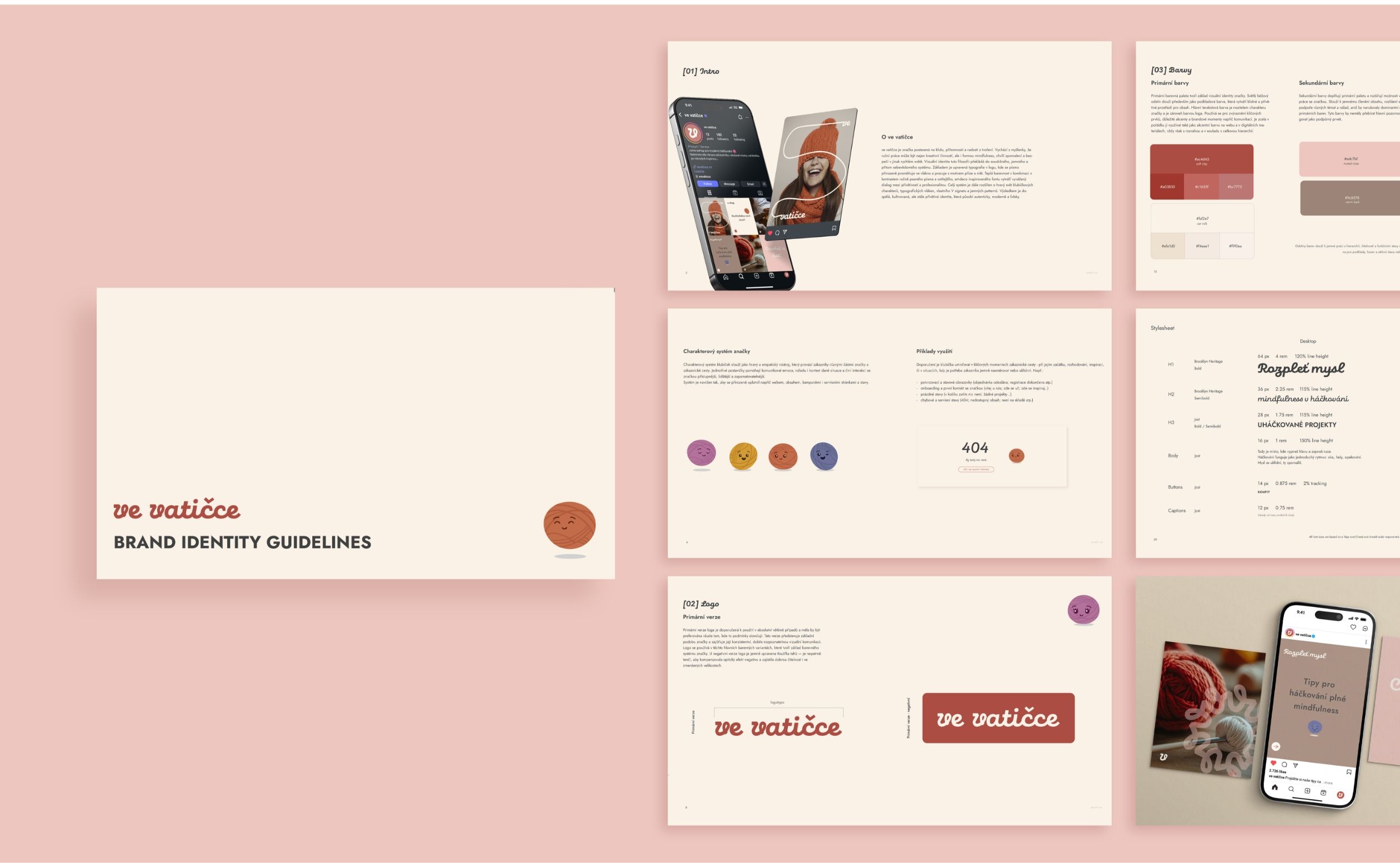
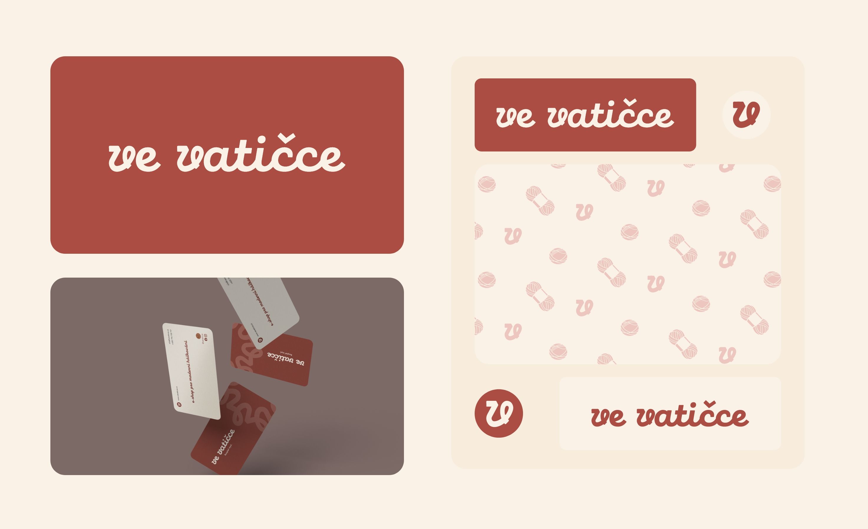
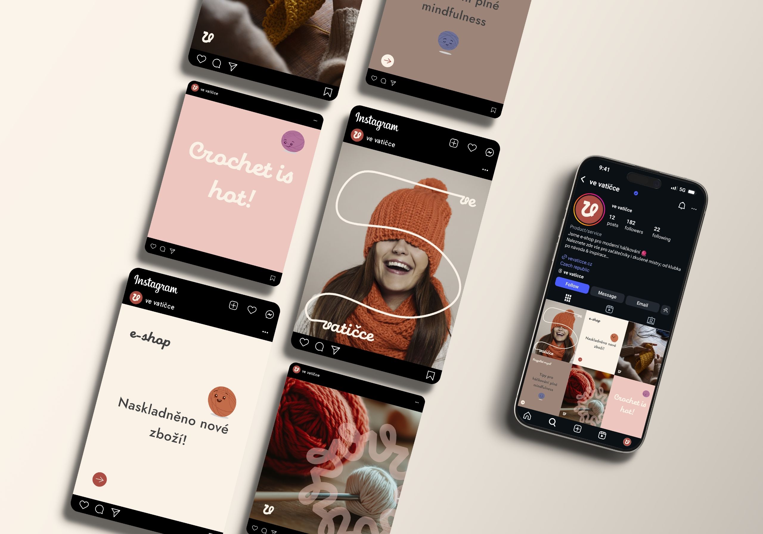
The identity was built as a modular system inspired by yarn, threading, and repetition, core elements of crocheting itself. At the center stands the logo and custom typographic approach, where letters subtly echo the softness and rhythm of yarn. Surrounding it is a layered visual system that allows the brand to adapt its tone depending on context.
The system works in these layers:
Primary: Logo, core color palette, and typography forming a calm, stable foundation for all communication.
Secondary: Simple character illustrations acting as emotional anchors—bringing warmth, approachability, and subtle storytelling into the brand.
Tertiary: Supporting assets such as the typographic yarn, brand vignette, and background patterns used as accents, textures, and visual rhythm.
Together, these elements create a cohesive ve vatičce universe that feels handcrafted yet professional. The identity supports both quiet moments of focus and expressive brand storytelling.
Turning “Detangle your mind” into a living brand language
The final identity transformed ve vatičce into a confident, recognisable brand with a strong emotional core and clear visual structure.
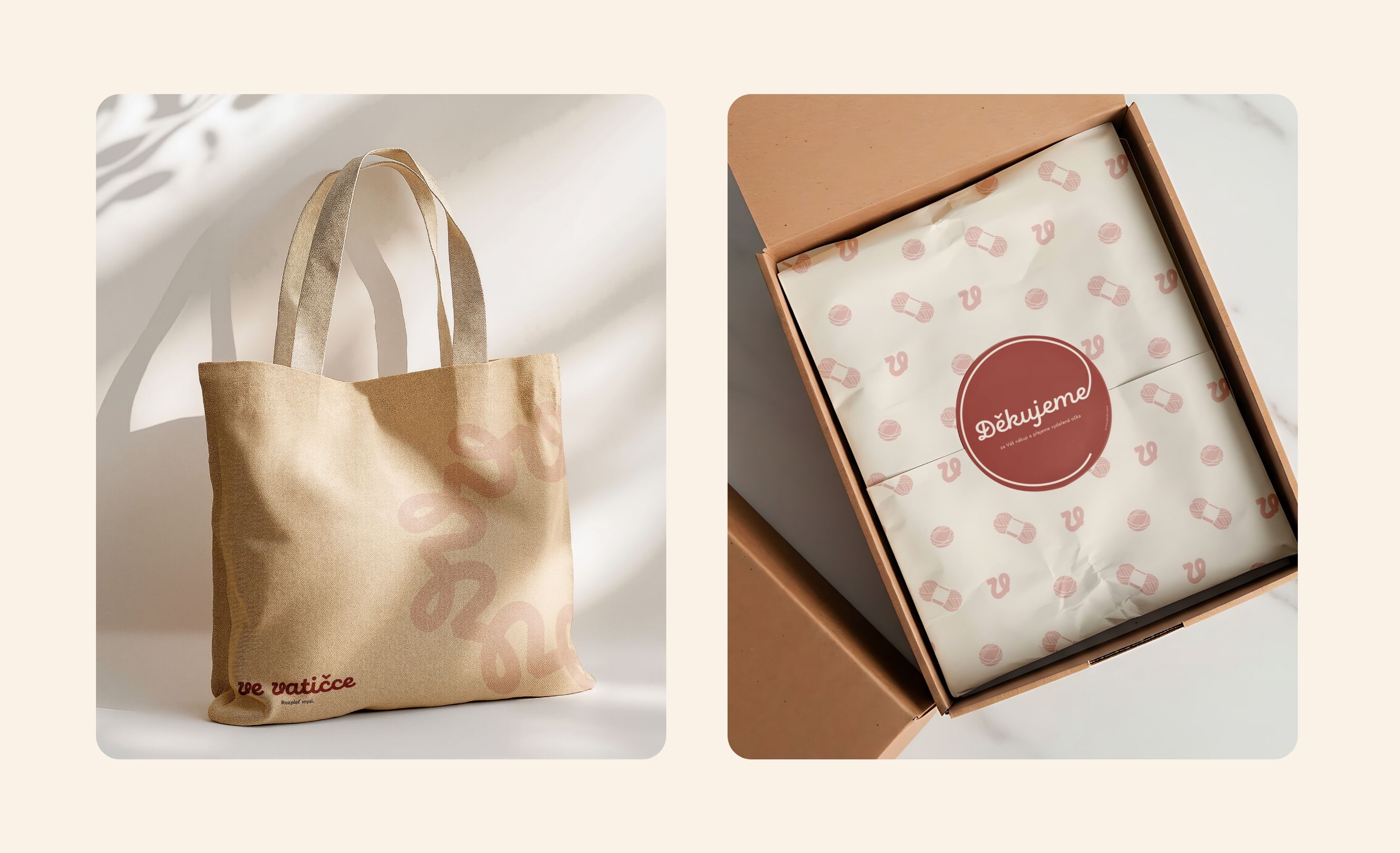
The modular system allows the brand to communicate consistently across social media, educational materials, print, packaging, and future product lines while remaining flexible and human. ve vatičce now has a visual language that reflects its philosophy “Detangle your mind” - translated into a brand that feels warm, thoughtful, and genuinely inviting.
Testimonial
Real results, real partnership
""Amahi managed to create a fresh, modern brand identity even for such a traditional field as crocheting. They brought thoughtful ideas that naturally supported the core concept. For our new brand, they quickly identified priorities and provided clear, easy-to-understand direction, which saved us both time and budget.""